

2019’s Spring colors undoubtedly are in, according to Pantone’s Spring-Summer colors contain a plethora of vivid colors to spark the imagination of anyone.
This new year’s color choices are interesting enough indeed. From bright colors live ‘Living Coral’ a snazzy shade, a mix of burnt orange and peach. Then theirs ‘Rose Dust’ a type of neutral pastel pinkish brown. This year we did not quite get an ‘Inferno Red’ however I think you’ll be quite satisfied with ‘Persian Red.’

With that being said, with all of these color choices, it could quickly become a wearisome task of choosing which colors to use in your home’s interior this new year.
The Design Approach favorite new color of the moment would have to be ‘Marrs Green.’

As described in Italian Bark as a dark teal and blue-green, which they actually revealed as the worlds favorite color.’ I happen to agree, however, we have chosen the color ‘Sea Foam Green,’ ‘Champagne’ and ‘Gold’ undertones, as our color combinations of the moment.


So go ahead and allow yourself to become inspired, as we explore various ways to incorporate these colors into a beautiful streamlined balance of style and color.
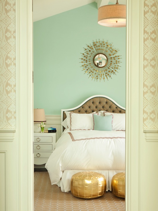
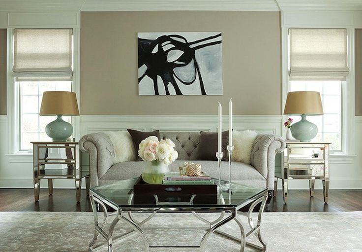
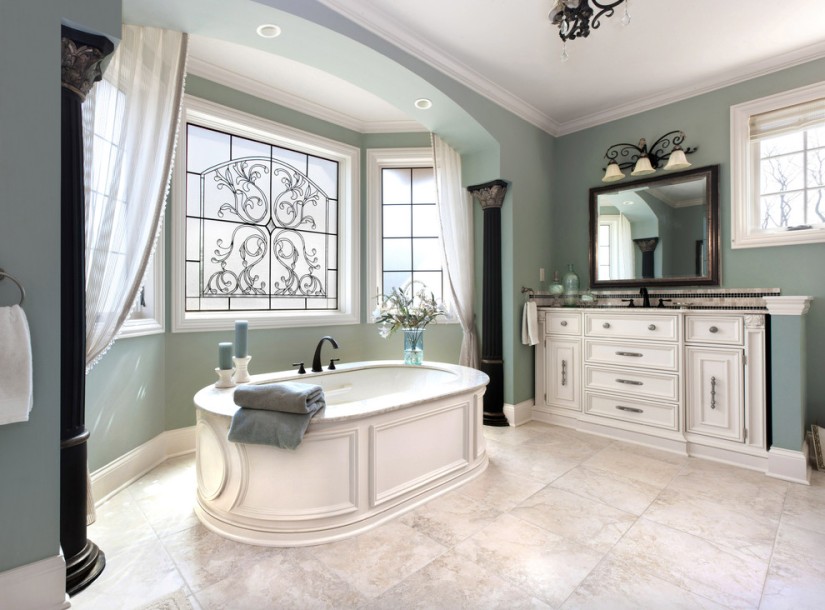
I think what’s ideal about this color combination is the subtly of ‘SeaFoam Green’, which happens to reflect light well enough to use in any room. Some colors that are as equally gorgeous can only handle being contained to smaller spaces, such as 2017-2018’s color ‘Dinner Party,’

previously featured in what was CDP+ Interior Design Home & Decor’s blog. While the hue ‘Champagne’
which will be used as the neutral color, in order to balance the bold ‘Gold’. Just as you wouldn’t use gold throughout every room, the rich color that it is will be used to highlight this color trio.
How To Incorporate These Colors Into Your Home’s Decor
I love the seemingly limitless ways that you can use the color ‘Sea Foam’, to transform any room of your home. From the main room to the master bedroom, to a nursery all the way to toddlers on up.
As in these images, gold is used sparingly in the decor which makes this nursery gender neutral. Accents such as a well-placed rocking chair and certain decor make this room color a win-win.


From pre-teen to teenagers ‘Sea Foam Green’ is used carefully whether applied as paint or wallpaper/treatments by incorporating the color scheme, and using ‘Gold’ as the trim or even by adding gold draperies or champagne colored blinds.


When used in a pre-teen or teenage boys room the combination works as well. Once again, since it is a gender neutral color; you could also play with varying tones and shades. ‘Sea Salt’ from Sherwin Williams, is of a similar shade.


Your kitchen and bathroom deserve some attention. A good idea is to include a two-tone Sea Foam/Champagne room. Either horizontally on the same wall or vertically on adjacent walls.


Remember that considering your decor can also add to your theme, and simply have fun looking around for the perfect accessories for your homes latest makeover.
Stephaniemary Fagbeyiro
Blogger/Student of Design and Business Owner
